A personal page for ux designers
UX hiring managers aren't grading your visuals. They're checking how you think: the problem, the evidence, the trade-offs and what changed. A UX portfolio is a set of short arguments, and most are far too long.
What your page should include
- Two or three case studies told as problem, process, decision, outcome
- Your role on each project, stated honestly
- Research evidence: what you learned and how it changed the design
- A metric or qualitative result for each
- NDA work summarised publicly, detail shared privately
Sections that work
Case studies → How I work → Experience → What teammates say → Contact
Looks to start from
Swiss Kinetic or Bento Mono: structured, calm, grid-driven. Ivo can restyle any of them to your colours.
What a UX hiring manager actually checks
A UX design lead reviewing a portfolio usually spends a few minutes on it, and they're looking for evidence of thinking. Did you understand the problem before designing? Did research change your mind? Can you explain a trade-off? Did anything measurable happen after launch? Polished mockups help, but they're the last thing on the checklist, not the first.
That's why the most common UX portfolio mistake is length. A thirty-screen case study with every sticky note proves effort, not judgement. Lead with a summary and let the curious reader go deeper.
A case study structure that gets read
For each of your two or three best projects:
- One-line summary: "Redesigned onboarding for a B2B payroll app; activation up 18% in a quarter".
- Your role and team: "Lead designer, with one PM, four engineers and a researcher". Overclaiming is the fastest way to lose an interviewer's trust.
- The problem and the evidence: the funnel data, interview quotes or support tickets that framed it.
- Two or three key decisions, each with the alternative you rejected and why.
- The outcome: a metric, a qualitative change, or an honest note on what didn't work.
- What you'd do next, in two sentences. Interviewers love this part.
NDA work without breaking an NDA
Most good UX work lives inside products you can't show. Strip names and numbers to relative terms, recreate key screens with dummy content, or describe the work without visuals. Check your contract before publishing anything.
On featurd, any section can be marked private. A private case study never appears on your public page; it only shows to people you send a tracked link to. You can send the full story to a hiring manager and see when they opened it, while Google and the public see only the summary.
Your featurd setup
- Header: "Product designer, fintech and B2B SaaS", with your city or time zone and whether you're open to roles.
- Cases: two or three case studies as cards, each with summary and result. Sub-pages hold the long versions.
- Private sections: the NDA detail, sent with tracked links.
- Text: "How I work", covering your research methods and design process in under 120 words.
- Experience: roles, companies and years, imported from your LinkedIn PDF.
- Testimonials: from a PM or engineer, confirmed with a Trust proof.
- Embed: a Figma prototype for one project, if it's shareable.
- Contact and Book: a short form, and a 20-minute intro call synced with Google Calendar.
An example page
Rohan Mehta, a product designer in Bengaluru, uses Swiss Kinetic: giant type, a red numbered list of three case studies. Case 01, "Payroll onboarding", reads "Activation +18%, support tickets −30%", and opens a sub-page with the story in six short sections. Case 02 is marked private: recruiters he's applying to get a tracked link that reveals it.
Below sit his experience, a Trust-verified quote from his former PM and a Figma embed of a shipped flow. When a recruiter from a fintech opens his link twice in one afternoon, featurd tells him, and he follows up that evening.
Junior, senior and lead portfolios differ
A junior designer's portfolio shows craft and learning: a clear process, sound research basics and honest reflection. A senior portfolio shows ownership: defining the problem, influencing the roadmap and measurable outcomes. A lead or manager's portfolio adds the team: how you raised the quality of others' work, built a design system or changed how the company makes decisions.
Write for the level you're applying to. If you want a lead role, one case study about building a research practice or a design system with adoption numbers is worth more than another polished screen.
Mistakes that sink UX portfolios
- Process theatre: personas and journey maps with no link to the decisions they changed.
- Dribbble shots presented as UX work. Visual exploration is fine; label it as such.
- No outcomes. If you can't share numbers, say what changed qualitatively.
- A portfolio that only works on desktop. Hiring managers open links on their phones between meetings.
Getting started
Upload your LinkedIn PDF or paste your current portfolio, and Ivo drafts the structure; you write the decisions. For visual and brand work, see designers, and for the job search itself, job seekers.
Looks to start from
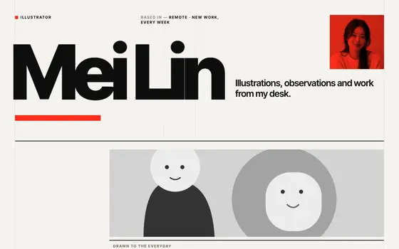 Swiss Kinetic
A Swiss poster that moves: giant type, red numbered rows, a visible grid.
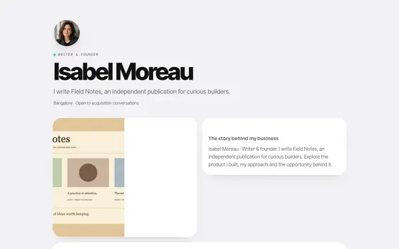 Bento Mono
Bento grid, Apple-calm: white tiles on soft grey, big tight type.
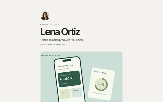 Studio
Quiet luxury. Big type, generous space.
See all 36 templates, live pages in Explore, or describe your own and Ivo builds it.
Questions
How long should a UX case study be?
Short enough to read in three minutes. Lead with a summary of the problem, your role and the outcome, then the two or three decisions that mattered. Put the long process in an optional deeper section.
How do I show UX work under NDA?
Publish a summary with the problem and the result in relative terms. On featurd, mark the detailed case study as private: it only appears to people you send a tracked link to, never on your public page.
Is this different from a general designer portfolio?
Yes. Visual and brand designers lead with images. UX portfolios lead with reasoning and evidence, and the images support the story. See our page for [designers](/for/designers) for the visual side.